So often we take intuitive-sounding numbers for granted, assuming they count what we think they are counting, only to later realize that they aren’t … wrong … necessarily, but they are incomplete in some big way. The “incarceration rate” happens to be one of those numbers.
The incarceration rate is supposed to tell us how many people (per 100,000) are in prison, and it does that… sort of. Our official “incarceration rate” is based on the number of people in our nation’s prisons on December 31 of any given year. And as a measure of average daily prison usage, it’s likely as good as any other day,1 and likely close enough to any sort of average across days to get the job done.
But when I think about incarceration rates, I’m less interested in one-day capacity issues (although those matter!) and more about how many people are coming into contact with the prison system. Now, in theory, a one-day count should do a good job of that–prisons, unlike jails,2 are supposed to be for people whose terms are at least a year and a day, which means everyone who goes to prison should get picked up by at least one December 31 assessment. But it turns out that a lot of people spend less than a year in prison, which means a lot of people do not show up in any of the counts.
By my estimate, looking at one-day counts underestimates the size of the US prison population–defined here as “people who go to prison in any year”–by about 15%. Which, given the size of our prison population, translates into millions of people, and suggests that our official incarceration rates understate the real impact of mass incarceration by something on the order of 40 to 50 per 100,000.
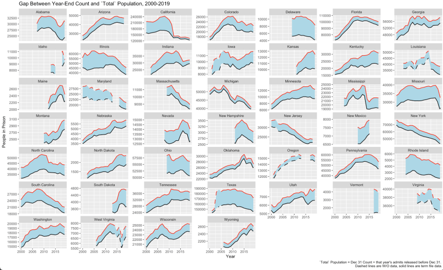
To see this, I use a dataset called the National Corrections Reporting Program, an incredibly detailed dataset with person-level data on tens of millions of people who have been sent to US prisons since 2000 (or, for a few states, even earlier). The graph below shows the impact of counting these “invisible” people in prison. The bottom, blue line on the graph is the official, December 31, prison population for each state; the upper, red line is that population plus everyone who is admitted and released within that year (and thus not in prison to be counted on any December 31).3
Two things stand out. First, every state that provides data to the NCRP has a solid number of “invisible” people in their prison populations, although states vary significantly in how many. Overall, across the NCRP but excluding California, something on the order of 13% of all people who enter and leave prison are not counted by our end-of-year count. With a state prison population of about 1.3 million today, that’s ~170,000 people we’re missing, each year. That’s millions of people over two decades (and the effect surely runs back into the 1990s and before). Include California, and it’s closer to 20% in the years before 2010.
And, arguably, these “invisible” cases are the most socially costly. These are the people who experience the disruptive experience of being sent to prison, but for the shortest, least useful amount of time–no time for any sort of training program, no meaningful incapacitation effect, hard to see any real retributivist gain. These millions of unseen admits appear to impose costs on people and communities with little if any upside to show for it.
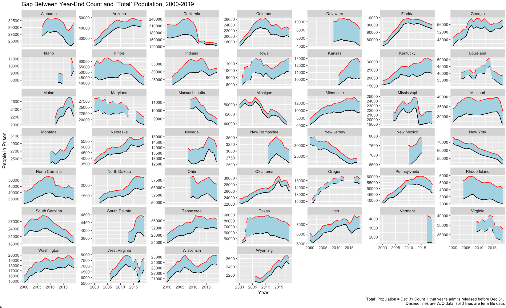
The second thing is ignoring the “invisible” people means that we significantly understated the impact of California’s Realignment policy on prison populations–which is the most significant, if under-discussed, criminal legal reform of the past 20 years. From its peak in 2007 to 2019, California’s official incarceration rate fell by ~33% (from 479 per 100,000 to 317, using the NCRP counts).4 But its total incarceration rate–those we count on December 31 and those who serve short terms–fell by almost 50% (from 657 to 332). It’s true that some of these declines came from diverting people from prisons to jails, but this still suggests that any estimate of that diversion likely overstates how many got diverted since our prison count understates the decline in people cycling through California prisons.
Another aspect of the “invisibles” is that they mean we overstate, to some degree, the number of people in prison for violent crimes. For years now, a majority of all people in the December 31 counts have been in prison for violence; by the end of 2019, 58% of all people in state prisons were serving time for a violent crime.5 But these people serving short terms are going to skew towards non-violent, and adding them back in pushes down the share in for violence by about 5 percentage points or so. Not enough, now, to push the share below 50%, but not a trivial impact either (and gets to a point I will come back to in the future, namely how prison populations look different when we look at the “churn” through prisons rather than one-day counts).
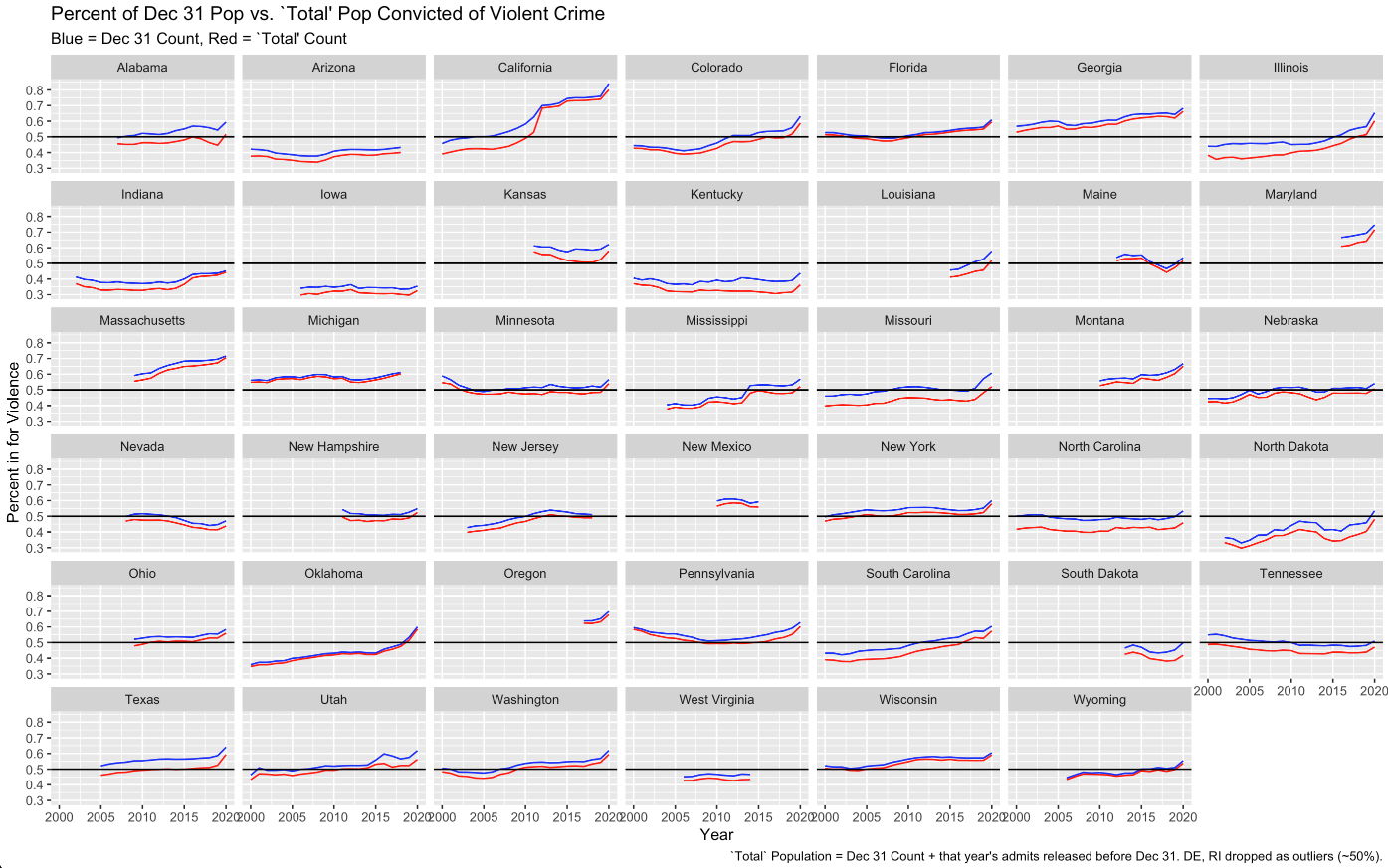
(Another point this second graph makes is that any sort of “in the US…” account of prisons is never really correct, since there is always so much variation across, and even (especially?) within, states. Like here. For the US as a whole, a majority of people are in prison for violence. But, say, Indiana, Iowa, or Kentucky? Their prison pops are driven far more by non-violent crimes.)
There’s much more to say about the implications of these overlooked people in prison, which I’ll get to in the weeks ahead. But it’s enough to start by flagging just how large a population we are consistently overlooking.6
.
- There may be some seasonality to prison populations, but guessing likely not too much (although I plan to check that out in the months ahead). I would bet the same is not true for jails, which likely show more seasonality. ↩︎
- The inadequacy of one-day counts for jail populations is well-known: the ~750,000 people in jails on any given night is a number well below the estimated ~10,000,000 admissions, who make up something on the order of ~5,000,000 people. The tl;dr for this post is “prisons have a jail-counting problem too.” ↩︎
- The dashed vs. solid line is a really technical point, only there for people familiar with the NCRP. Based on data quality, the NCRP measures populations in two different ways. The “term” file has one entry for each person, noting their entry and (if it exists) exit date, and allows you to connect people over time. The “widows and orphans” file (their name, not mine) has entries for each calendar year on admissions, population, and releases, but the entries are not quite so person-specific over time. ↩︎
- The Bureau of Justice Statistics’ prisoner-population data page gives slightly different numbers, because it relies primarily on a different prison population counting system, the National Prisoner Statistics. I’ll have some wonky post, probably several, down the line on the degree and implications of NCRP/NPS divergence. ↩︎
- For 2020, that percent rose to 62%, but 2020 numbers are going to be hard to understand until 2021 or 2022 at the earliest, since it will be hard to know which changes will prove transitory and which will permanent for a while. ↩︎
- Now, to be fair, one could probably back out some of this by measuring trends in the NPS’s December 31 counts alongside its measure of annual admissions, but it would be hard and messy, and more significantly no one does it. ↩︎

Pingback: Realignment: The Transformative (and Complicated) Reform No One Talks About – Prisons, Prosecutors, and the Politics of Punishment