In a recent post, I tried to shed some light on who was serving long sentences in prisons by looking at admissions data–how long did it take for people in a given admissions cohort to get released, based on what crime sent them to prison. (Short answer: the long-time servers were almost all in for crimes of violence, and most people weren’t in for that long regardless.) I think using admissions data to examine sentence length is a really good way to approach this issue, since it allows us to compare people sentenced under a common set of sentencing laws and political and other social pressures, and is useful for making long-run predictions about the future, since it allows us to calculate things like “what percent of people admitted for violence would we expect to be in prison after five years?”
But there is a clear limitation to this approach too: unless we have an incredibly long series of data (which here I sorta kinda don’t), it’s not possible to say much about who is serving very long sentences; in this case, with admit data only starting in 2000, I can only see who is left in after ~20 years. Long, but for the US, not necessarily all that long. Moreover, if our goal is to understand the history of mass incarceration as well, starting with the 2000 admissions cohorts means starting at the point where US incarceration rate starts to slow and then decline. Again, useful, but not so informative about what happened during the key growth decades of the 1970s through the 1990s.
To address these limitations, then, here I want to look at the release cohorts from 2000 onwards. In particular, I am going to focus on those who served at least 10 or 20 years in prison before they were released. Overall, the same story emerges: those serving long sentences are mostly in for crimes of violence. At the very long end, at times a majority of those released were serving time for homicide alone.
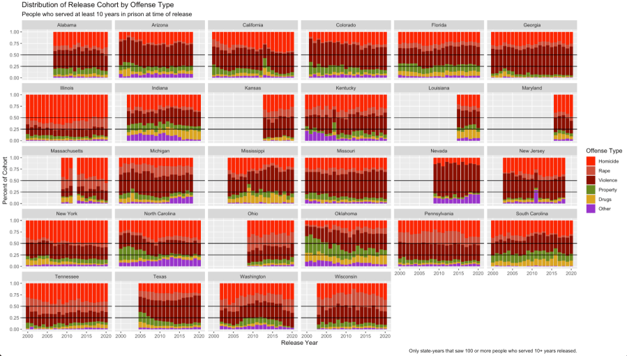
This figure tells the main story: it gives the distributions of offenses for each release cohort (“violence” means all other violence except for rape or homicide) for those who had served at least 10 years in prison at the time of their release.1 In almost every state, fully 75% or more of those released after 10+ years had been convicted of violence. In some places, like Illinois, over half had been convicted of homicide. Moreover, if there is any perceptible trend here, is is that violent offenses make up an ever-larger share of those serving long terms over the years.
You can also see California’s Prop 36 on that graph, which tightened up California’s three-strike law. California historically had had by far the most “generous” 3SYO law in the country, especially when it came to the third strike. In most states, the third strike had to be something violent, but in California it could just be stealing three golf clubs.2 In 2012, the voters adopted Prop 36, which required the third strike be a violent crime–and allowed those who had been sentenced under the old law but would have been ineligible for a third strike under the new one to petition for resentencing. That spike in non-violent cases in 2013 is a wave of successful petitioners (who had incredibly low recidivism rates).
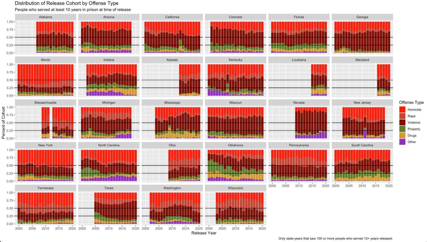
If we zoom in on those who served 20+ years, not 10+, the role of violence, and serious violence in particular, becomes even bigger.3 Across all the states here, a majority of all releases had been convicted of homicide, and well over 75% of some sort of violent crime. And, as always with conviction-offense data, it’s important to note that I don’t have a great sense of who is triggering repeat-offender laws; my guess is many if not most of the non-violent cases here are the product of those more than the actual conviction offense.
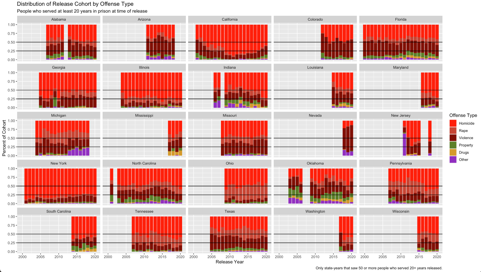
Interestingly, if we then zoom in on the people who served just 10-20 years, the story is still one primarily of violence. Which is to say: the major role of violence in the first graph (all those released at 10+ years) is not because of any outsized influence of those who served 20+ years, but rather reflects the fact that by the time we get to the 10-years-in mark, almost all people still in prison have been convicted of violence.4 The key difference with the 20+ population, though, is that non-lethal/non-rape violence is a far bigger part of the story.
Note, too, that there are definitely some intriguing patterns here that merit more investigation. Like the rapidly-vanishing share of rape cases in Texas (which doesn’t seem to coincide with an equally-large growth of rape cases in the 20+ graph, but then percentages can be tricky things to compare across different population sizes). Or, conversely, how it appears that Illinois started cracking down on rape in the 1990s-2000s,5 while Oklahoma shifted away from long sentences for property offenses (at least comparatively) over the 1990s (leading to the drops in the 2000s).
Finally, for completeness, here are how things look for those who served at least one full year and up to 5 years. Except post-Realignment in California, violent crimes’ total share is consistently well below 50%. And if there is any sort of noticeable cross-state trend, it’s the rising role of “public order” offenses, which includes things like DUIs and weapons charges. Still, even within the 1-5 year range–which is when the bulk of people admitted are released–a sizable chunk of those released were convicted of violence. In fact, these shorter-serving people likely make up a majority of those admitted for violence (percentages are hard).6

There is one more caveat to note. Neither this post nor my previous one can identify those who were admitted before 2000 but are still in prison after 2019. If these people are disproportionately convicted of non-violent crimes, then both of my posts have ignored them and thus oversold the role of violence. I very much doubt that this is the case–although it is not impossible7–but my next post in this series will look at what those who have spent years and years in prison still without release look like, just to be thorough.
.df
- I limited myself here to release cohorts that had at least 100 people who had served 10+ years. For some states, the number of such releases was well below that, which just produces noisy, hard-to-interpret results. ↩︎
- The way you know there is no 8th Amendment outside of the death penalty area is that the Supreme Court found that a 25-year sentence for stealing three golf clubs and a 50-year sentence for stealing nine VCR tapes did not amount to cruel and unusual punishment. ↩︎
- Note that here I set the minimum number of cases at 50, not 100, because 100 dropped too many state-year pairs; even with 50, you can see mid-series gaps where states didn’t have enough observations for one or two years. ↩︎
- “Wait!” you might say. “What about those still in prison who have not been released? They don’t show up in any of these graphs.” Good point. I’ll get to them shortly. ↩︎
- The increase starts around 2010, but since these are people released after 10-20 years, the sentence was imposed 10-20 years before the release. ↩︎
- As a percent of those released, people convicted of violence make up a fairly small share. But as my previous post made clear, those released for violence in the first five years likely make up more than half of all those admitted for violence. A smaller percent of a much bigger population could result in more people than a much bigger percent of a smaller number of people; that’s likely the case here. ↩︎
- See, for example, these cases out of Louisiana, where people pled guilty to super-long sentences for drug crimes, relying on the long-established tradition of being up for parole in 10 years (still a long time!), only to have the state change its parole practices. ↩︎

Pingback: A Final (For Now) Look at Sentence Length: Those Still Serving – Prisons, Prosecutors, and the Politics of Punishment